Clover Go
Clover Go is Clover’s point of sale app, which allows business owners to easily accept payments on the go. In 2021, Clover Go was redesigned with enhanced functionality to be more intuitive and to enable the core workflows used by employees. I was the lead content designer for Clover Go and helped bring the new vision to life.

Key responsibilities
Content strategy
UX research
UX copywriting
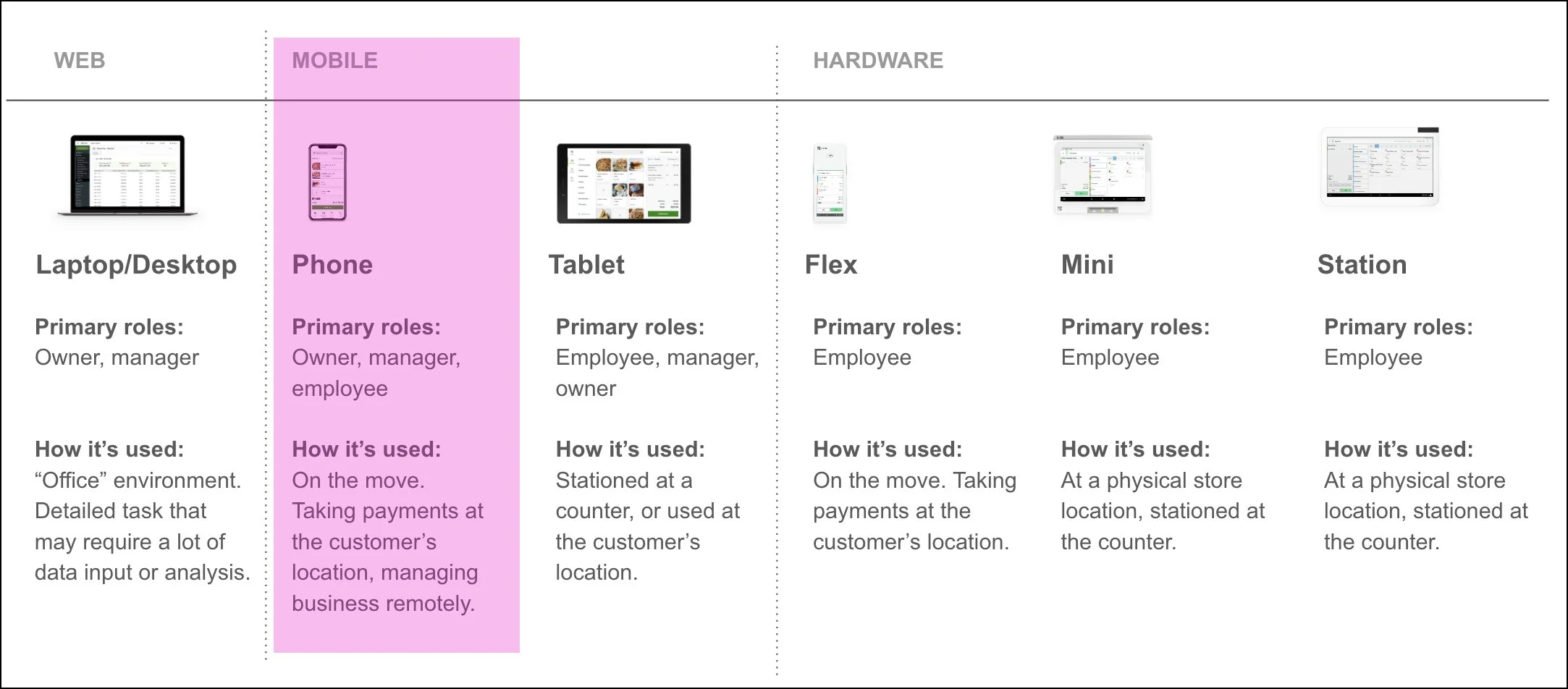
Before the redesign, we conducted several interviews with existing merchants to understand the core tasks and audiences for each of Clover’s main form factors (web, mobile and POS hardware). This gave us a better understanding of the core tasks to focus on for Clover Go.

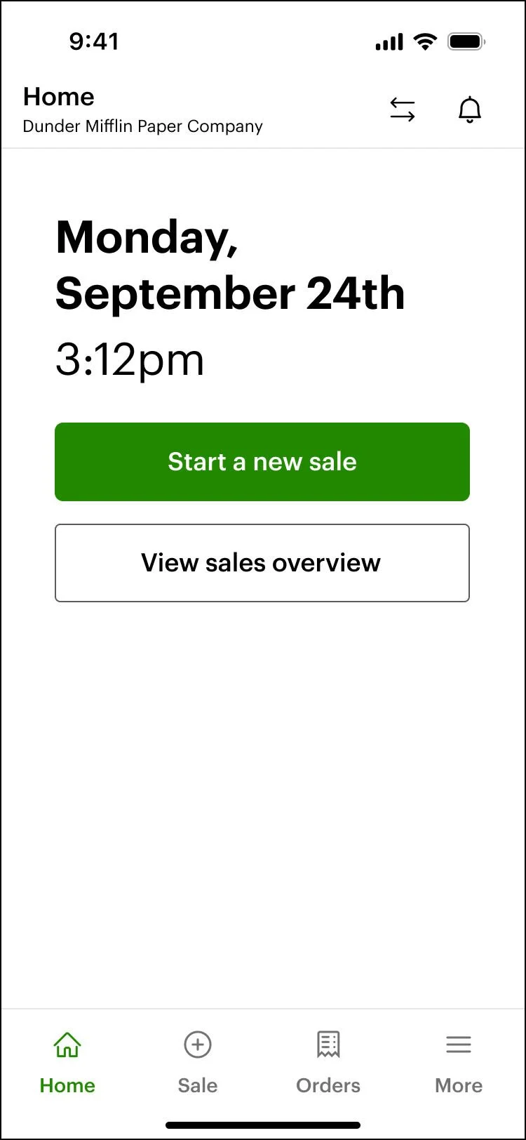
Home
From merchant interviews, we discovered that the core tasks for owners/ managers and employees using Clover Go were starting a new sale and managing the business remotely. We redesigned the homepage to focus solely on these core tasks, removing any unnecessary information and visual clutter.
Before
After
New sale
The older version of Clover Go did not support itemized sales, which we knew merchants wanted. We redesigned the new sale experience to support itemized sales so users could add items directly from the inventory. This not only made it easier for users to add items quickly, it also allowed users to track their sales better for reporting purposes.
Users can still take non-itemized sales, although it now lives as a secondary action within the interface (not a primary action).
Before

After

Checkout
One of our goals with the redesign was to ensure the user had the right information at the right time. In the older version of Clover Go, the total on the checkout screen was very small. We increased the font size and enhanced the placement of this information so it’s clear what the customer owes.
Additionally, new payment methods were introduced in the redesign, including the ability to send an invoice.
Before
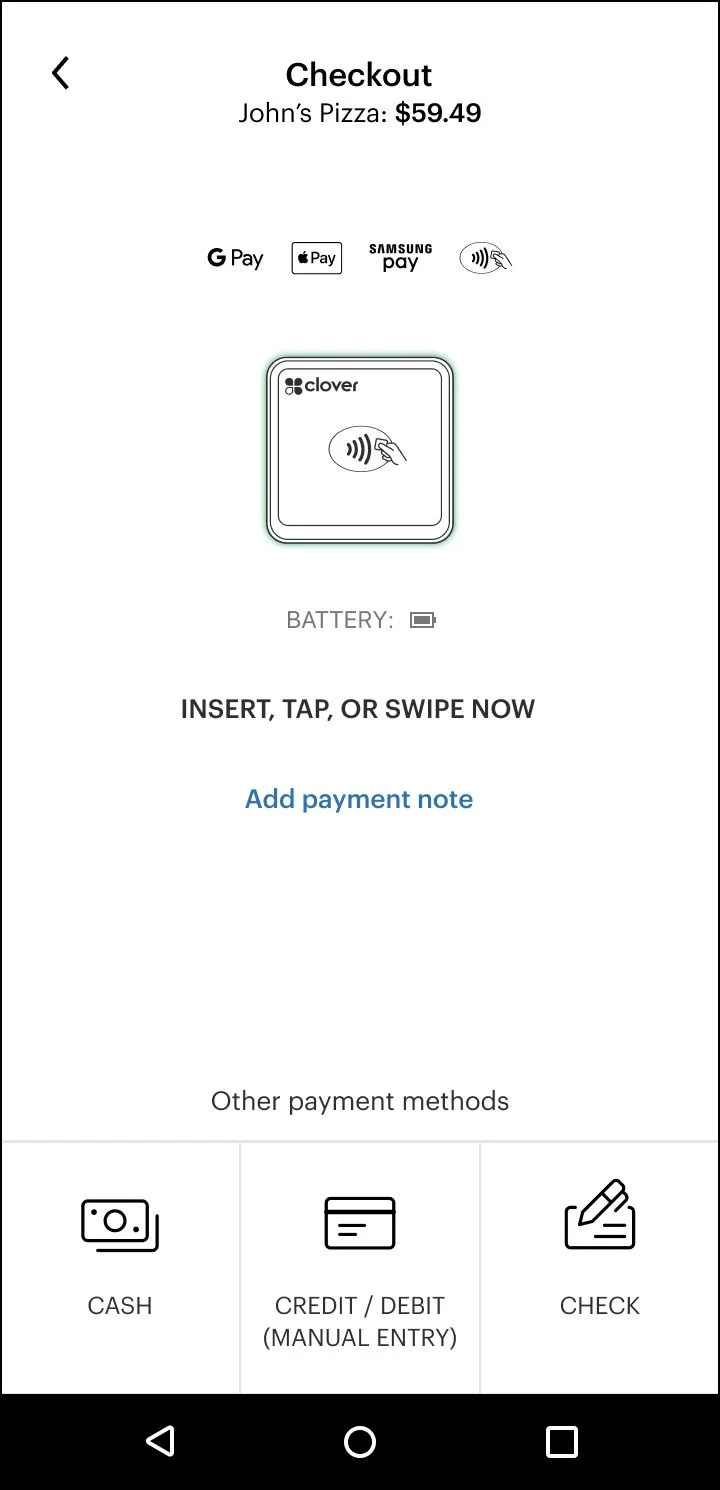
After

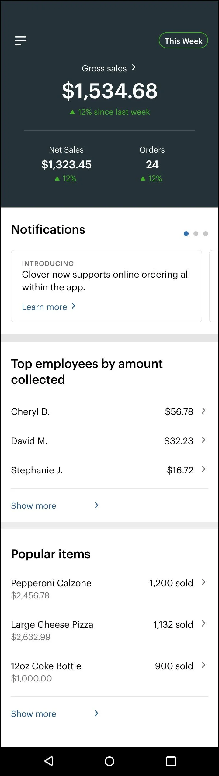
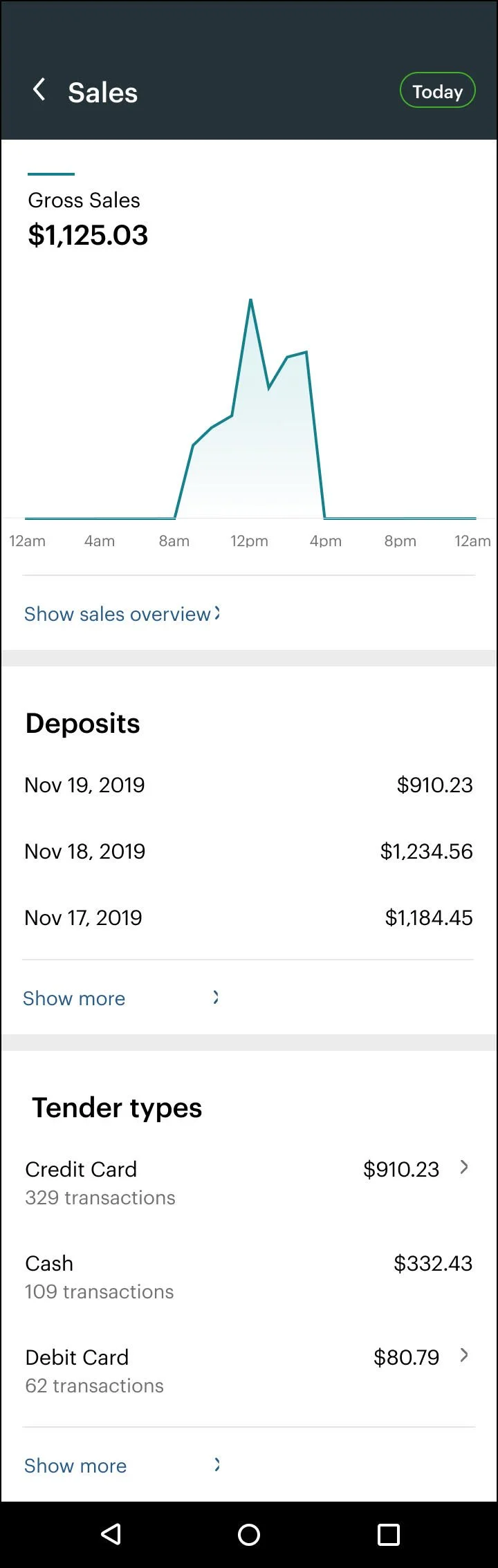
Sales overview
The sales overview page was another area that lacked focus. We wanted to maintain the same information, but display it in a more visual way that was easier for merchants to understand at a glance. We leveraged data visualization to provide more visual views of key information, like net sales. We also displayed snapshots of data (such as the total Refunds or Discounts) versus detailed data to keep the information focused. Deep links provided entry points into more detailed and comprehensive data.
Before
After

Results
43% increase in daily sessions
34% increase in monthly active users
Millions in engineering costs saved annually